Menu
Accelerating




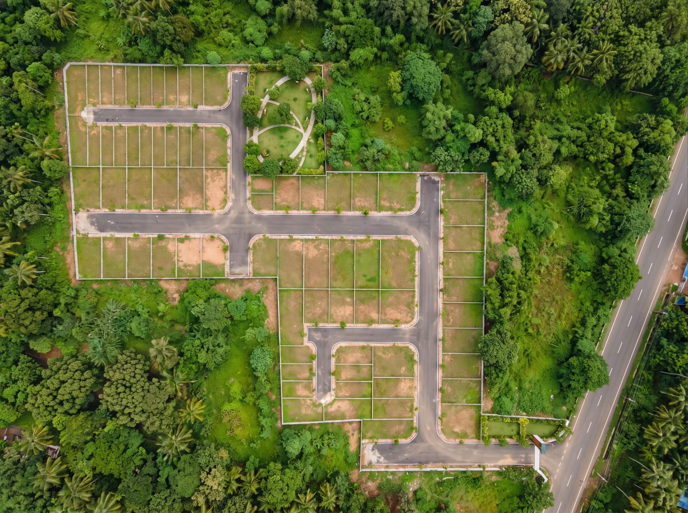
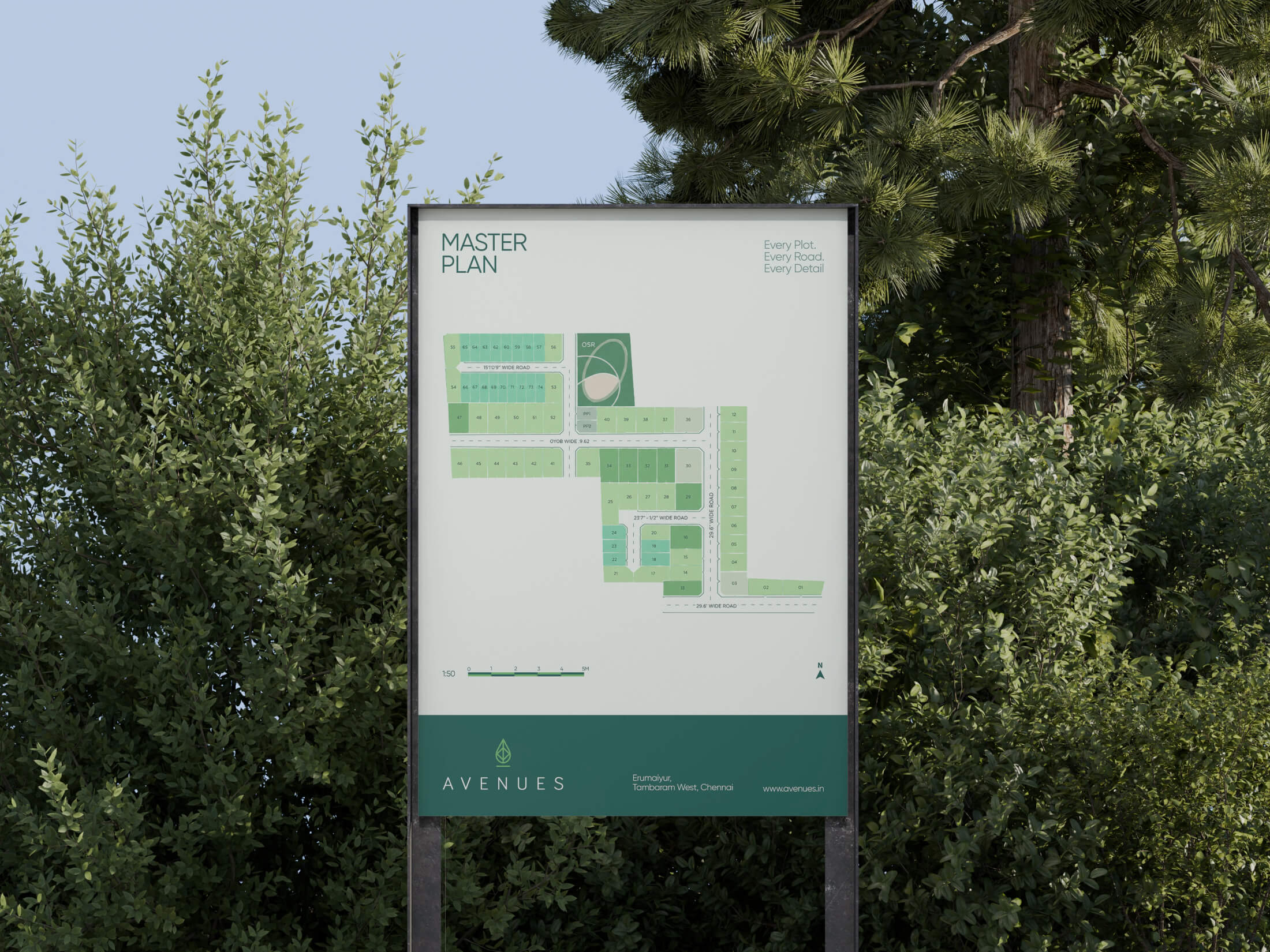
Avenues is a plotted development on Chennai's Outer Ring Road, offering 74 premium plots planned around natural surroundings.
The challenge was to position the project beyond the conventional promise of land as an investment and build a brand around the idea of growing into a future shaped by nature.
The identity draws from the relationship between nature and growth. The leaf at the heart of the mark represents nature, renewal and new beginnings.
Its upward movement reflects growth and possibility, connecting Avenues to the idea of a future taking shape.
Rather than illustrating nature literally, the visual identity maintains a restrained language for clarity.
The result is a visual language that feels calm, contemporary and grounded.

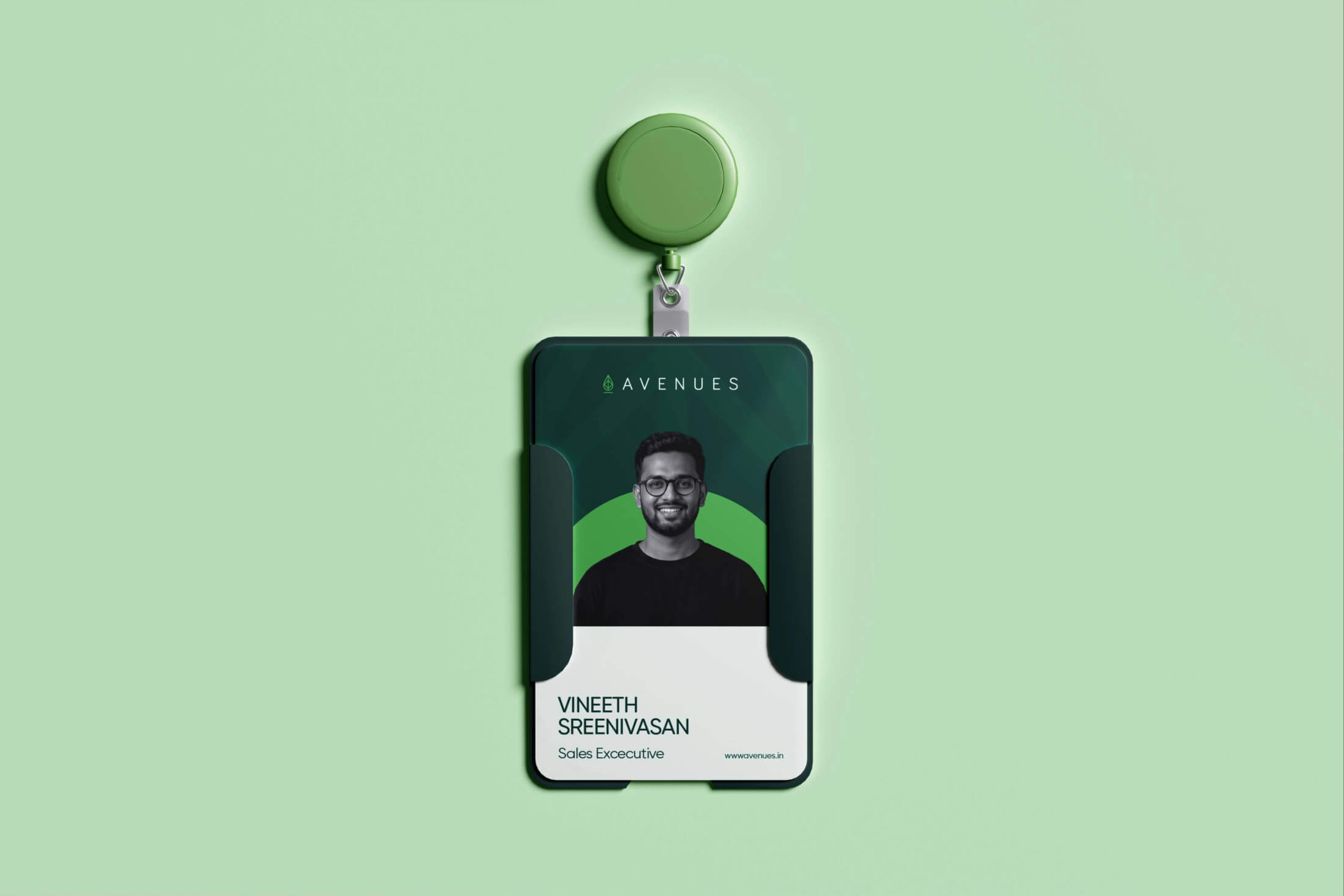
The visual system extends this idea through a restrained palette of Deep Forest Teal, Meadow Sage, Antique Sand and Ivory Sage, bringing together the earthiness of the landscape with the optimism of growth.
RGB: 41, 71, 63
DEEP FOREST TEAL
HEX: #29473F
RGB: 129, 172, 104
MEADOW SAGE
HEX: #81AC68
ANTIQUE SAND
HEX: #C0A372
IVORY SAGE
HEX: #F3F7F0
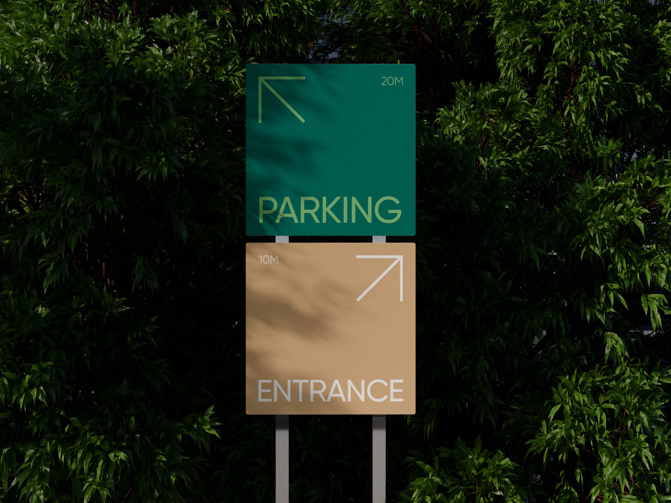
The verbal identity moves away from the transactional language of plotted real estate and speaks instead about possibility, belonging and the future.
Words like grow, nature, future, dreams and peace become recurring ideas across the communication.
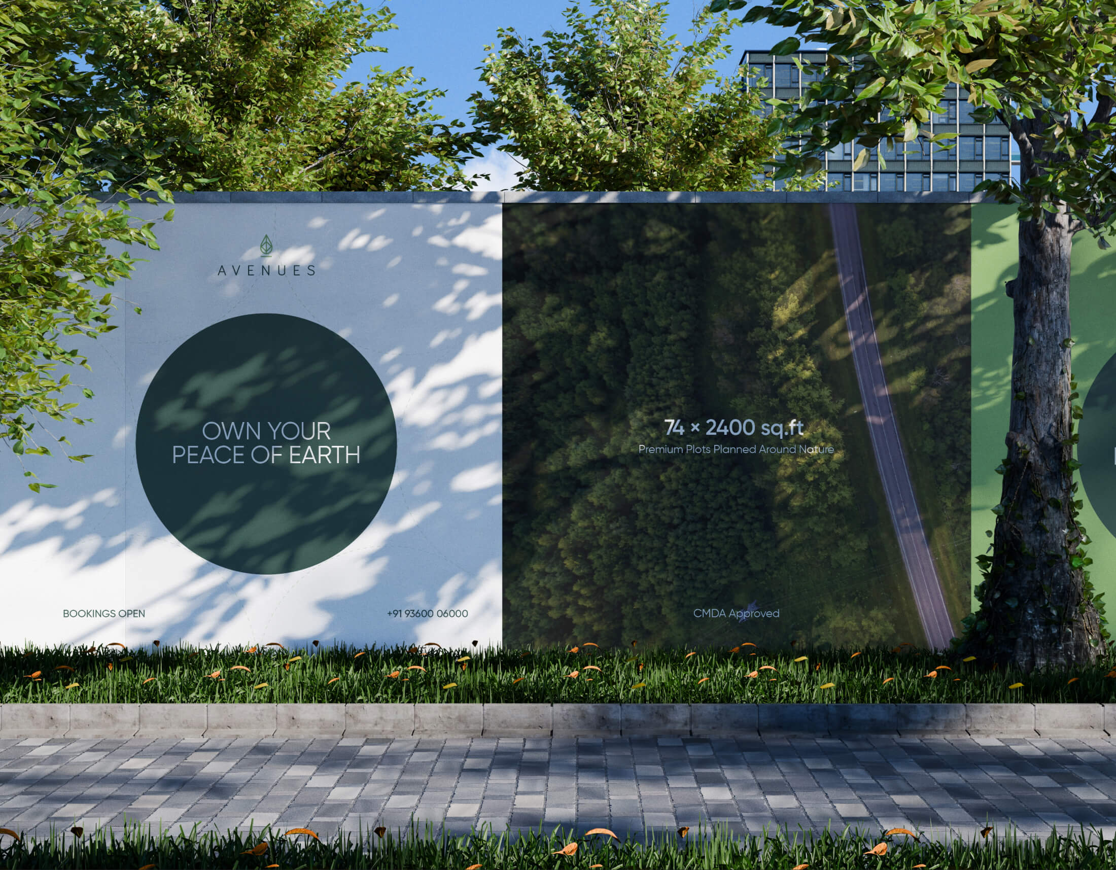
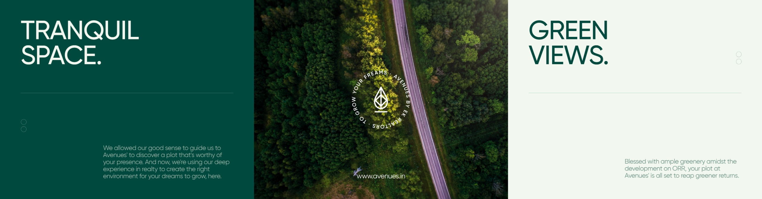
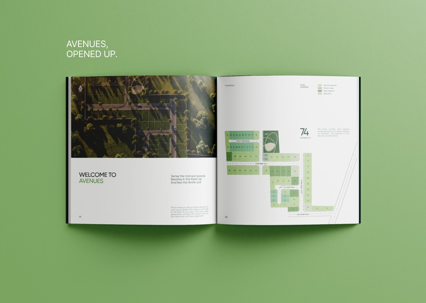
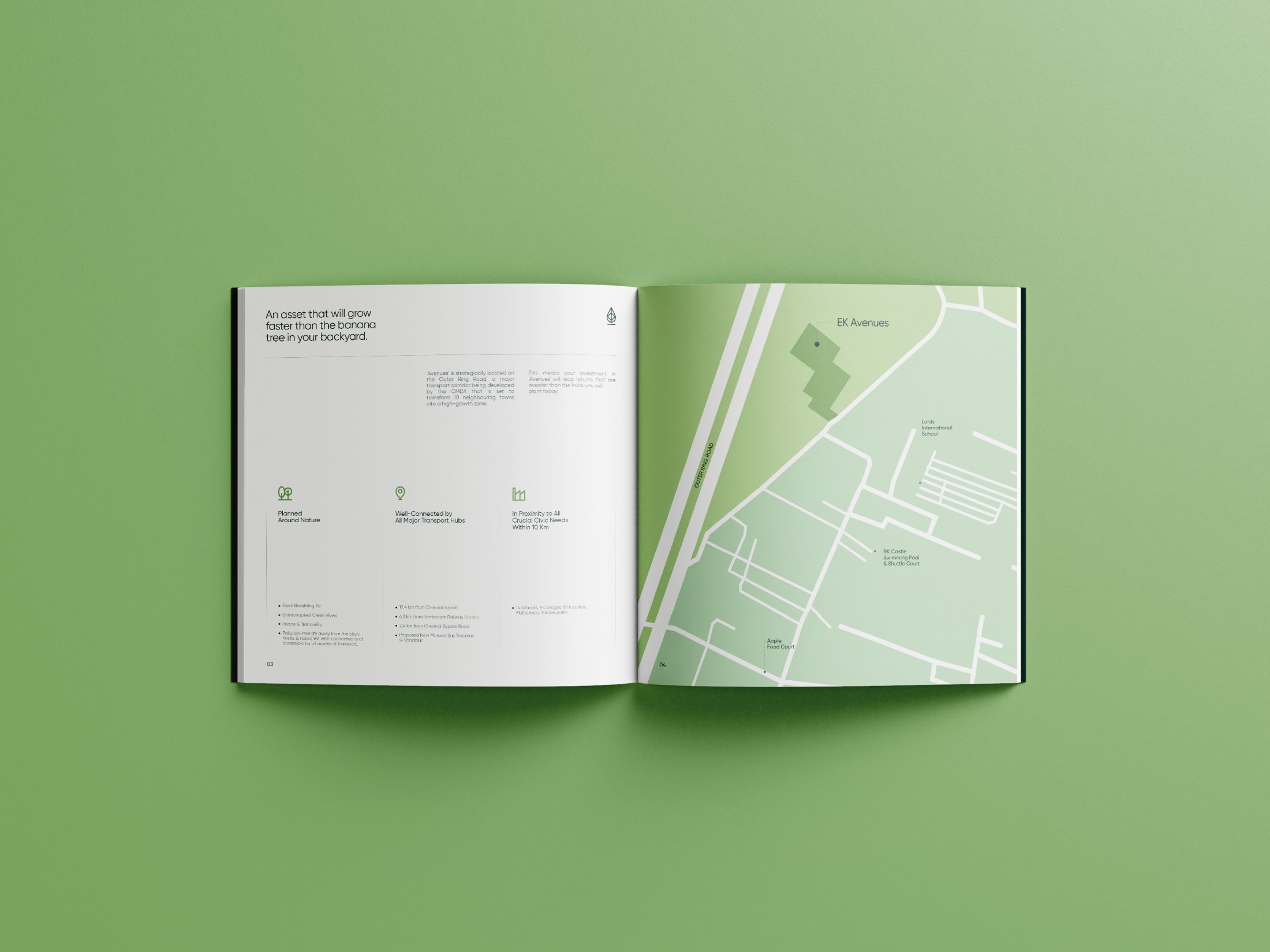
Bariol defines the character of the logo, while Gilroy is used throughout the identity and publication, creating a consistent typographic voice across headlines and information.
Its geometric construction brings a contemporary character to the brand, while its clean forms allow imagery, colour and the natural visual language to take prominence.
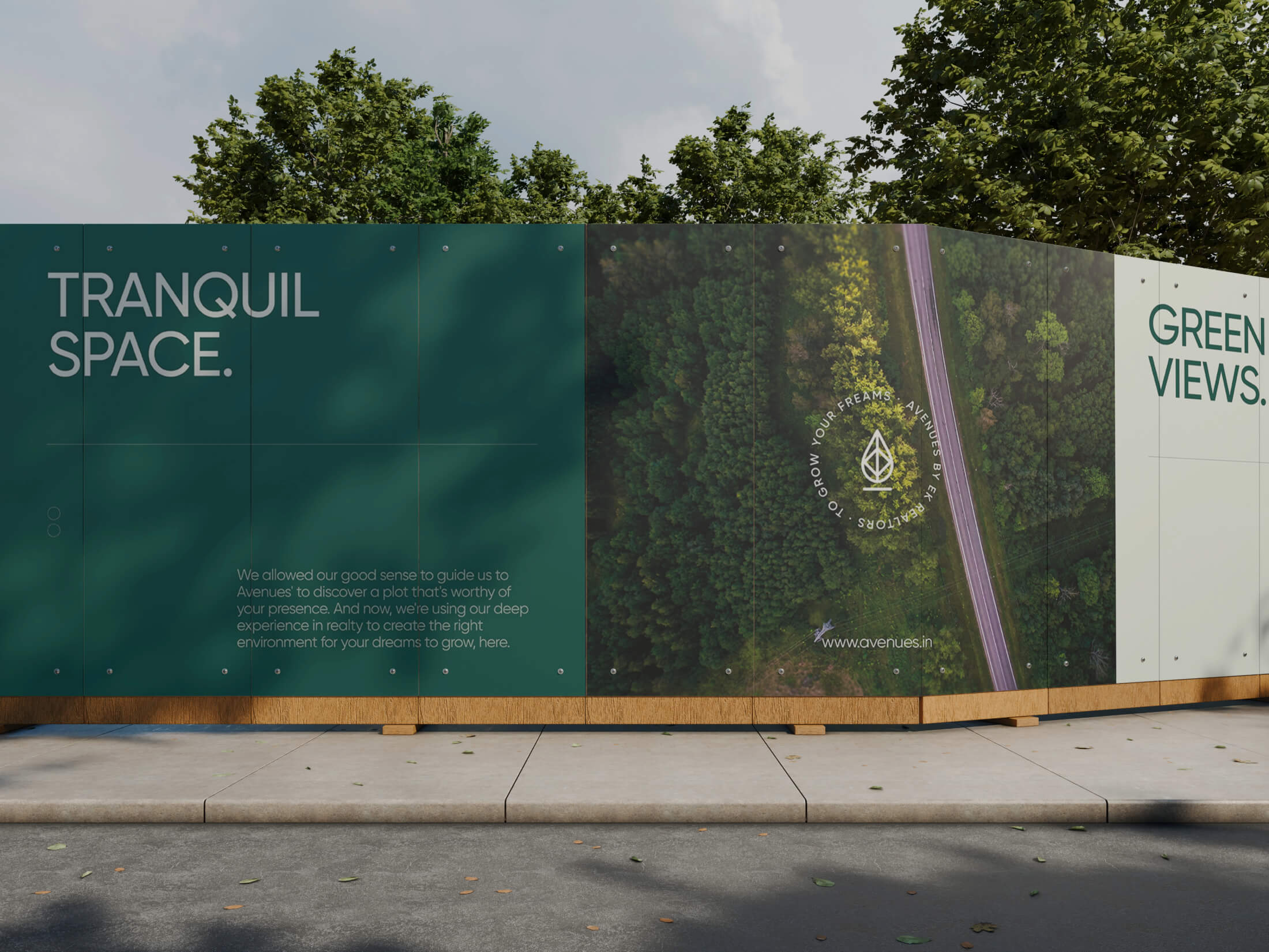
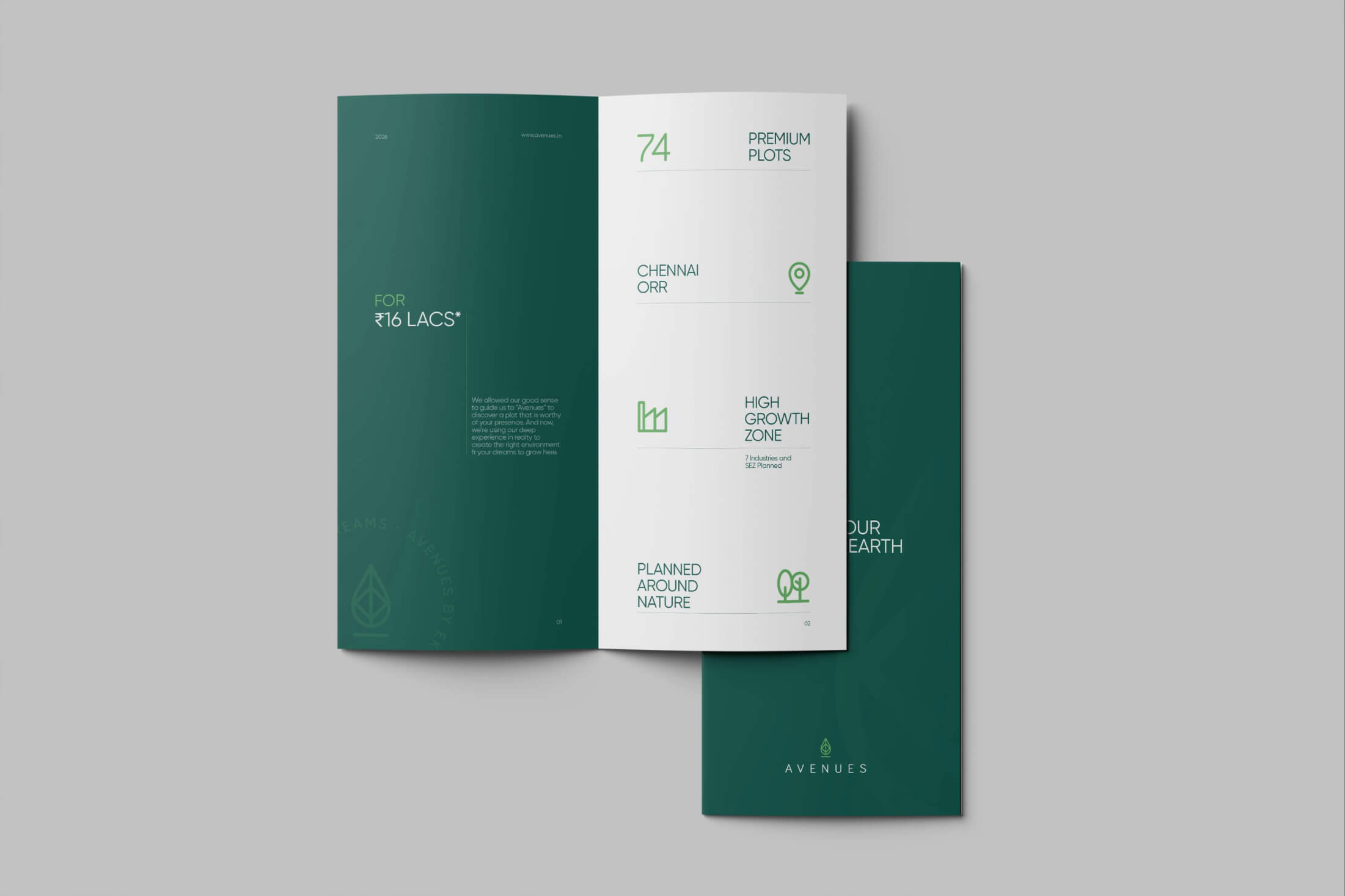
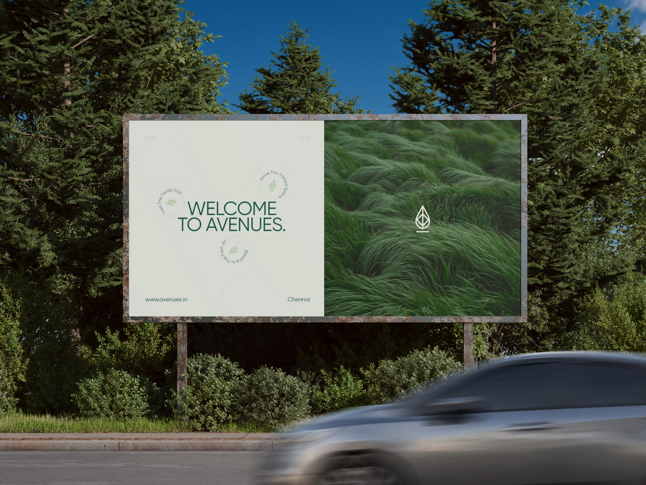
The identity, language and publication work together around one central idea: nature as the foundation for a future.
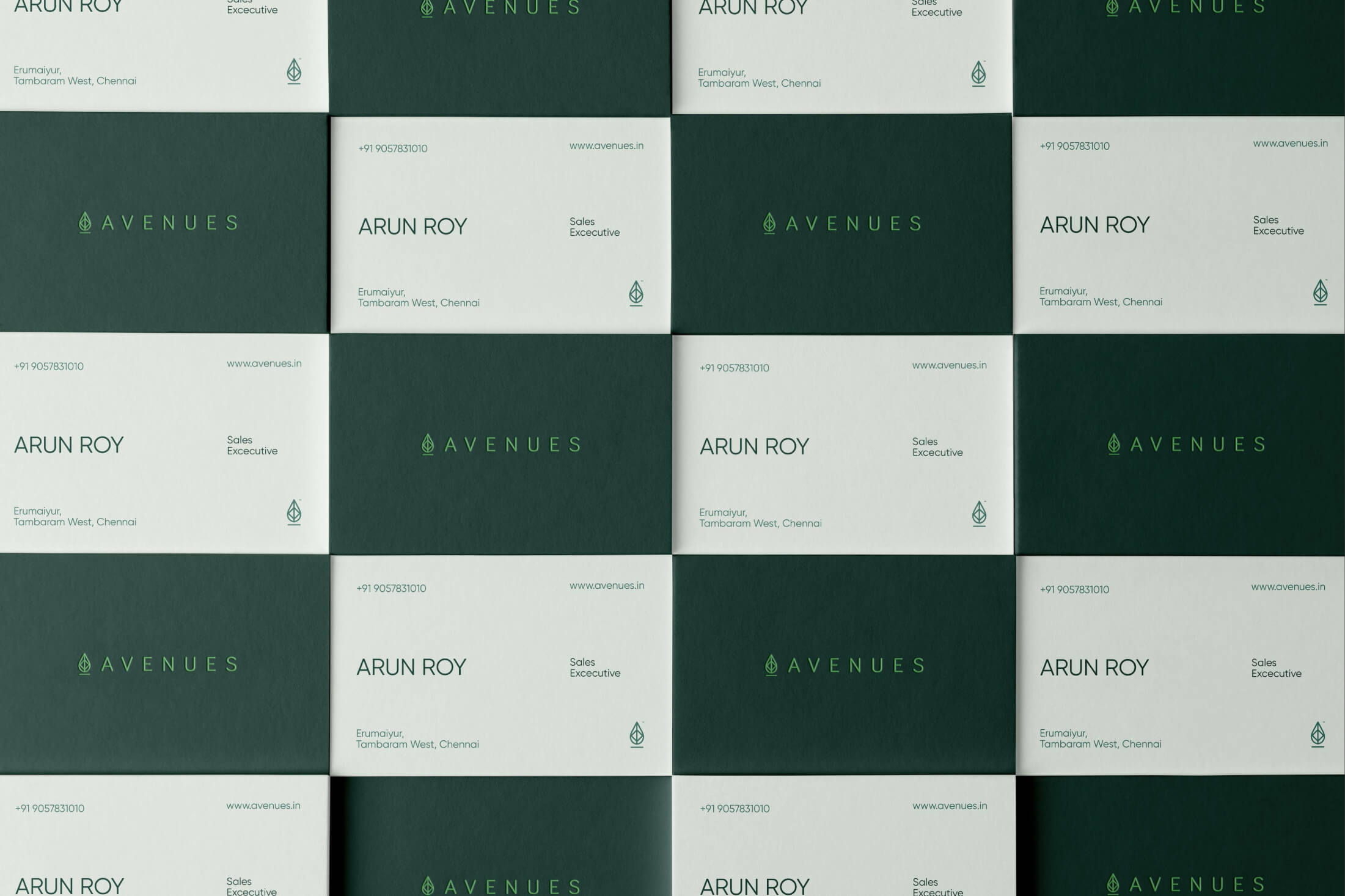
From the logo and colour system to the brochure, hoardings and project communication, Avenues maintains a consistent visual and verbal world — one that makes the development feel less like a parcel of land and more like a place where something can begin.


For Avenues, we built a brand around the possibility of what comes next.

The visual identity
creates the world.
The verbal identity
gives it a thought.
Publication design turns that
thought into a journey.