Menu
Accelerating


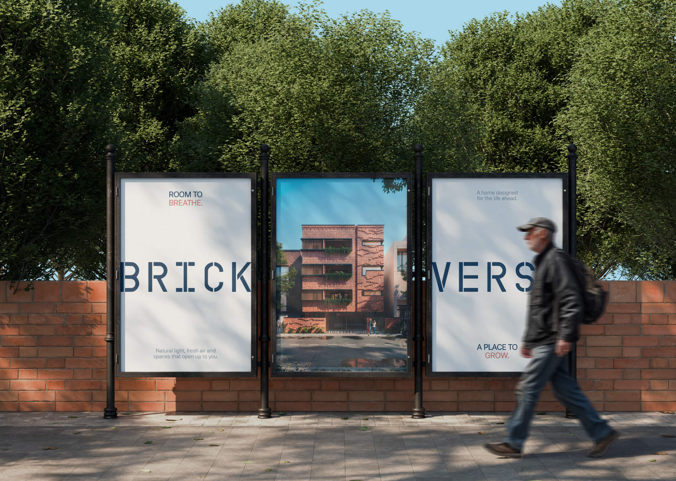
Brickverse is a residential development in Selaiyur, Chennai, built around the idea of a more considered kind of urban home.
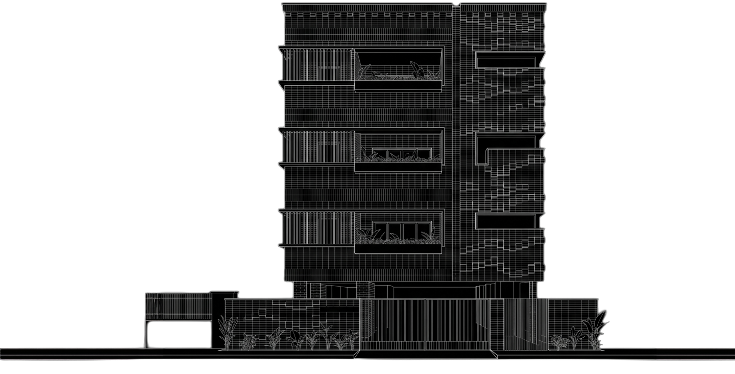
Its proposition brings together privacy, natural light, fresh air and generous living spaces — combining the feeling of an independent home with the convenience of a connected community.
The idea was to move Brickverse away from the visual language of a conventional apartment project.
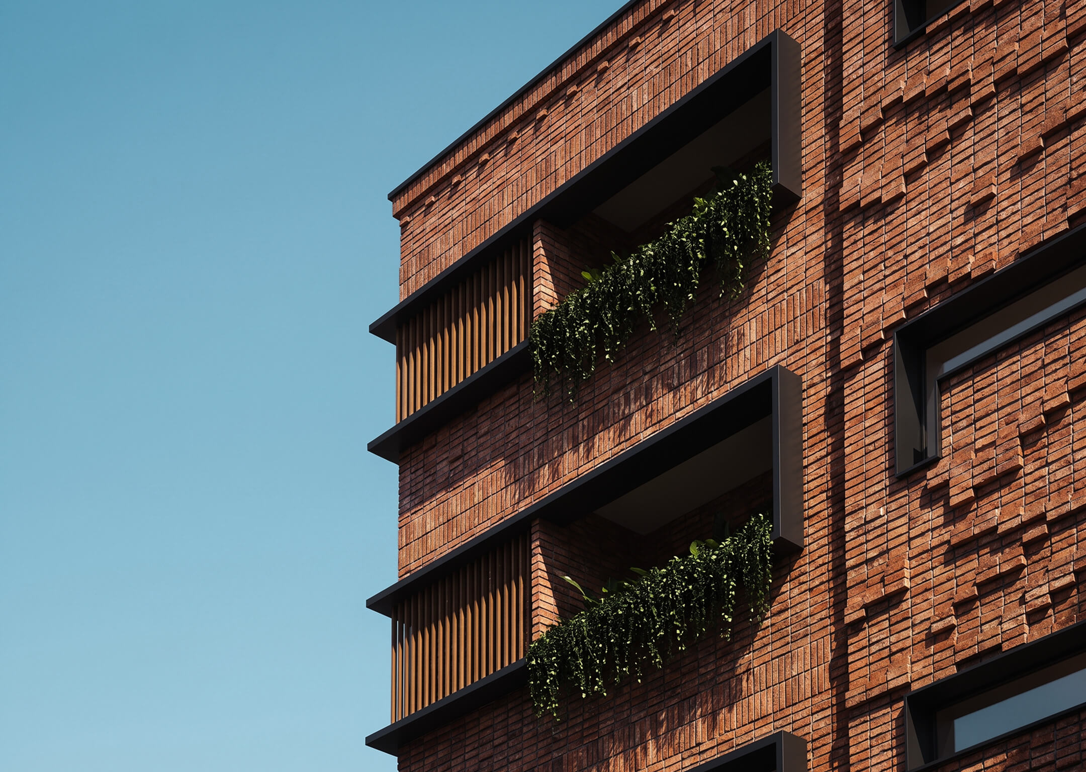
We built the identity around a contrast: the solidity of brick and the softness of living.
Architecture, nature, warmth and everyday life became the foundation for a brand that feels grounded, human and quietly contemporary.
The Brickverse identity draws from the materiality of its architecture.
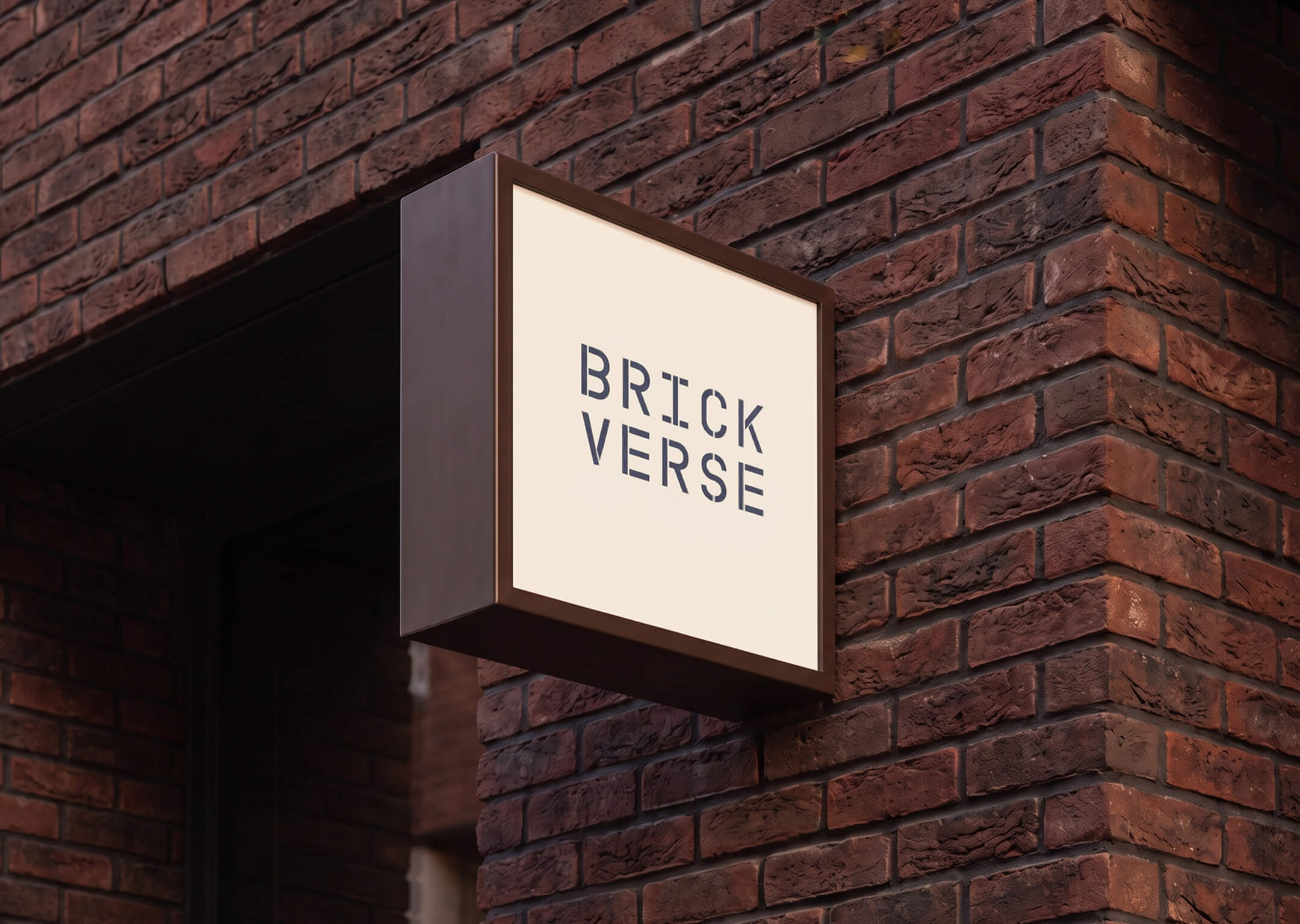
The stencil-inspired logo gives the wordmark a constructed, architectural character — bringing the idea of brick, structure and craftsmanship into the identity itself.
The visual system balances this solidity with softer imagery, generous white space and warm accents, creating a brand that feels architectural without becoming rigid.
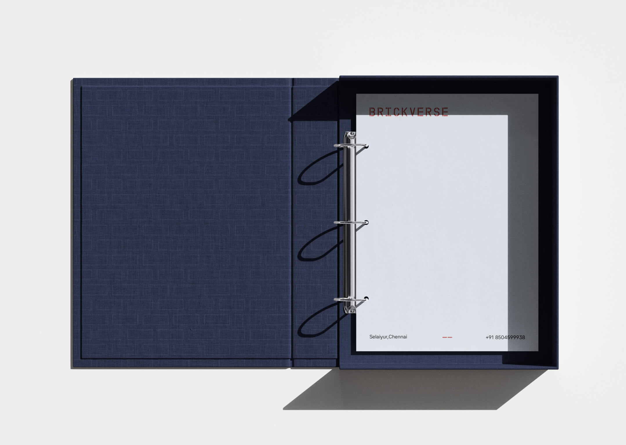
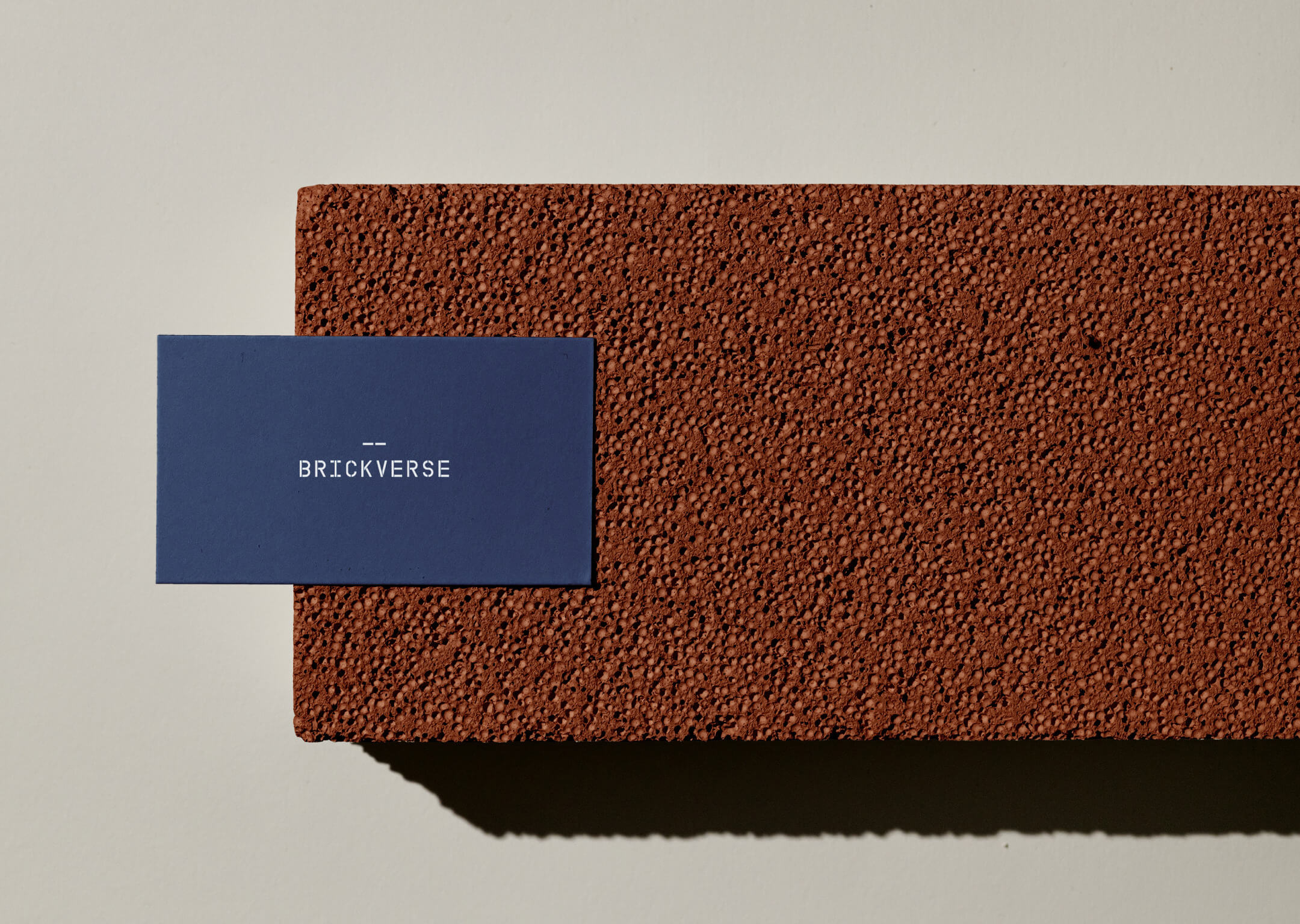
A deep navy blue gives Brickverse its depth and sophistication, while warm brick and muted blush tones bring a more human character to the identity.
The palette reflects the project itself — solid in its foundations, warm in the way it lives.
HEX: #192647
HEX: #AF7266
HEX: #EFEFEF
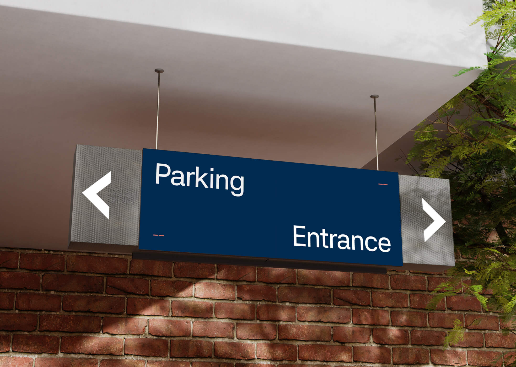
The verbal identity speaks less about specifications and more about what those specifications enable.
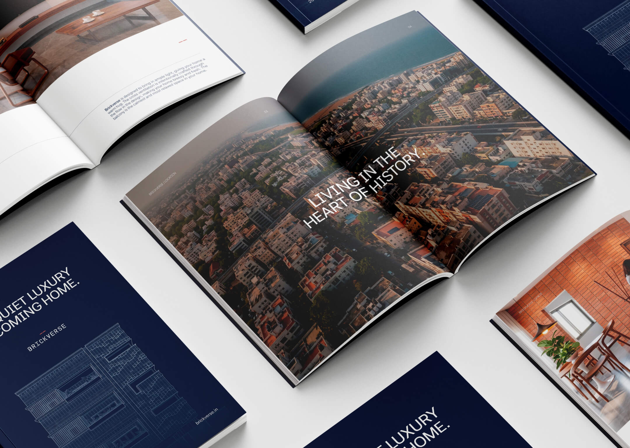
The brochure is structured as a gradual discovery of Brickverse.
It begins with the home and its proposition, moves through location and the “E Factor,” then explores lifestyle, space, specifications and floor plans before returning to the wider question of connectivity and everyday convenience.
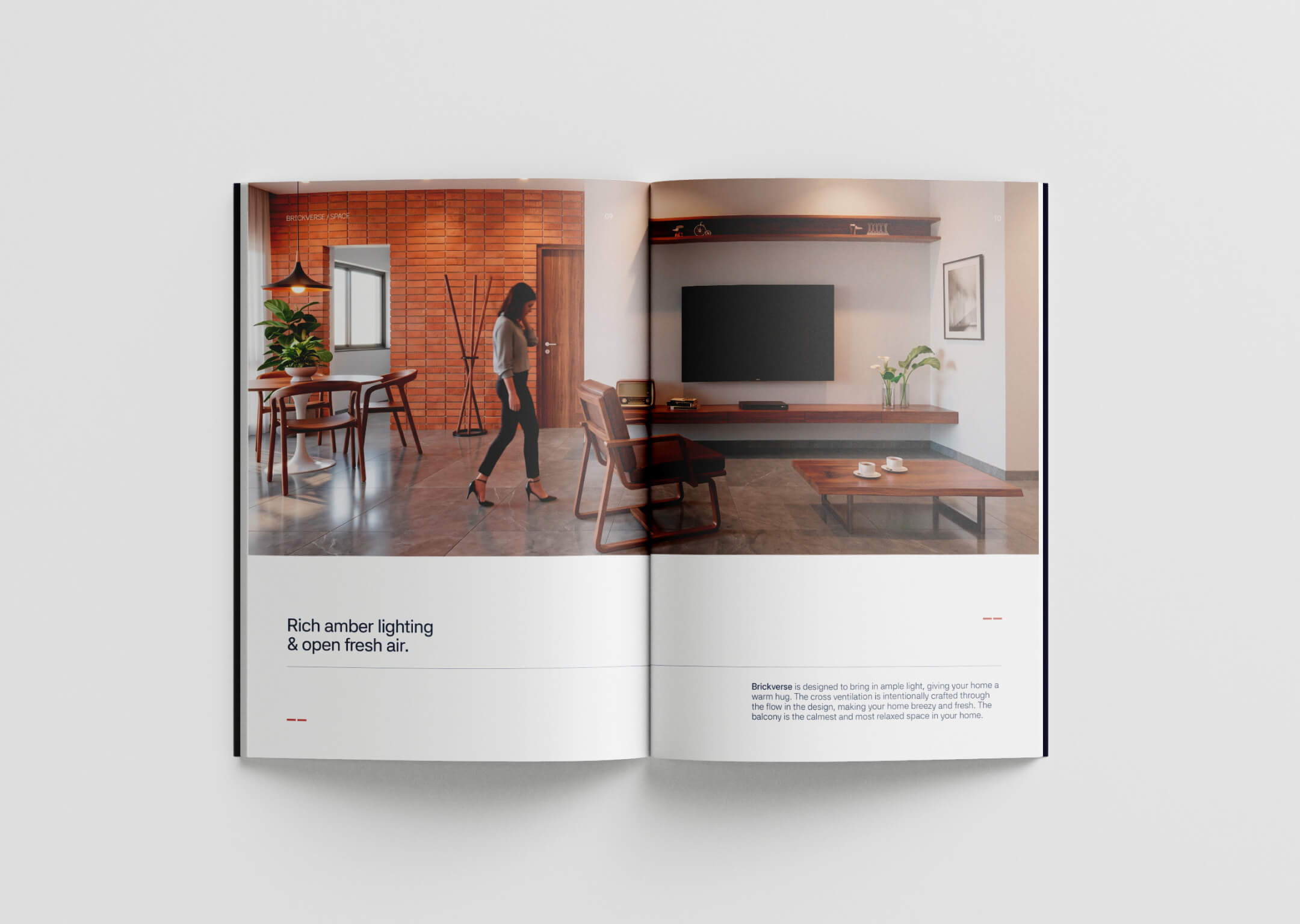
42dot Sans is used across headlines and body copy, creating a single, consistent typographic voice.
Its clean structure gives the communication a contemporary architectural quality, while the restrained layouts and generous whitespace keep the publication calm and approachable.
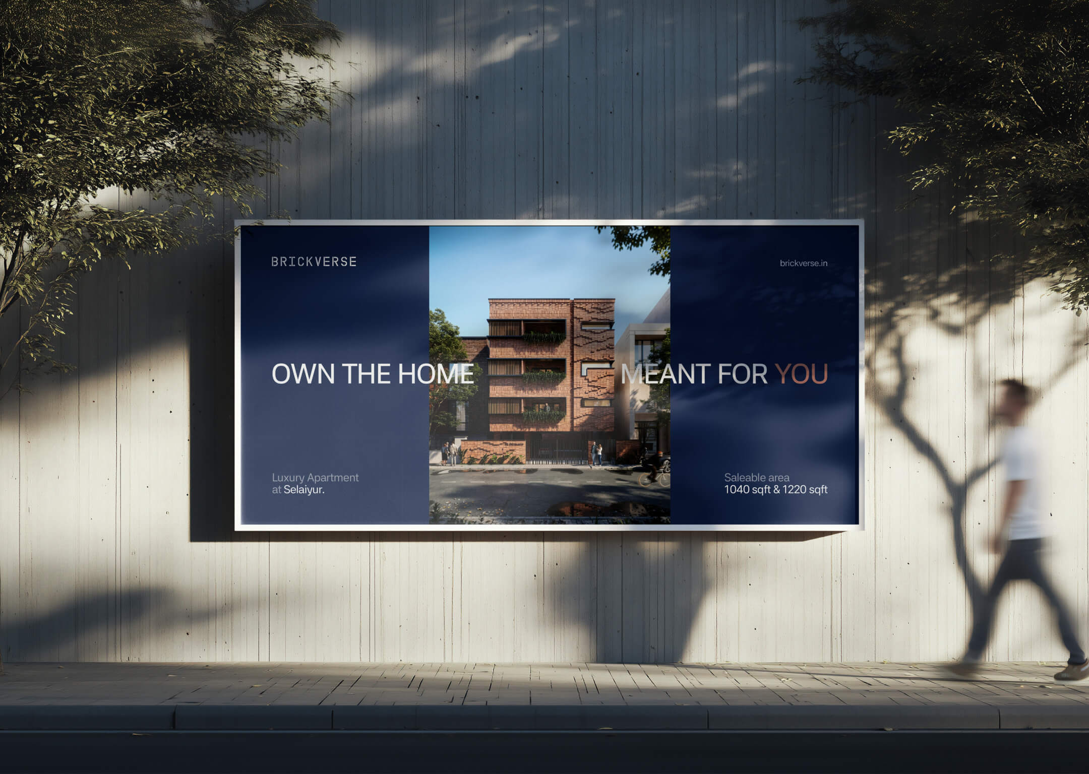
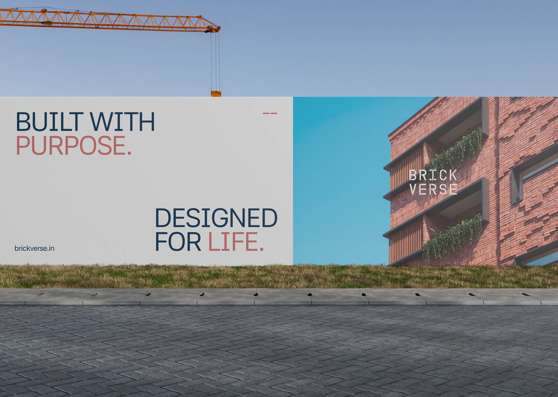
Across identity, language and publication, Brickverse is built around one simple tension: a solid home designed for a softer way of living.
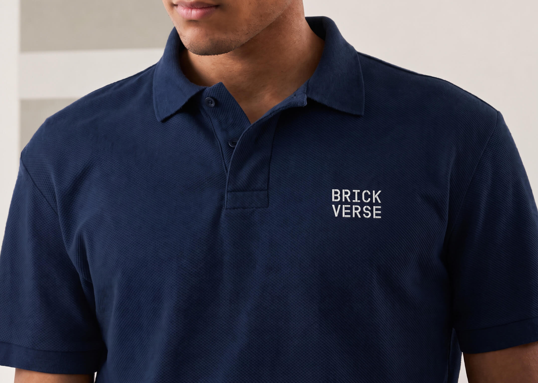
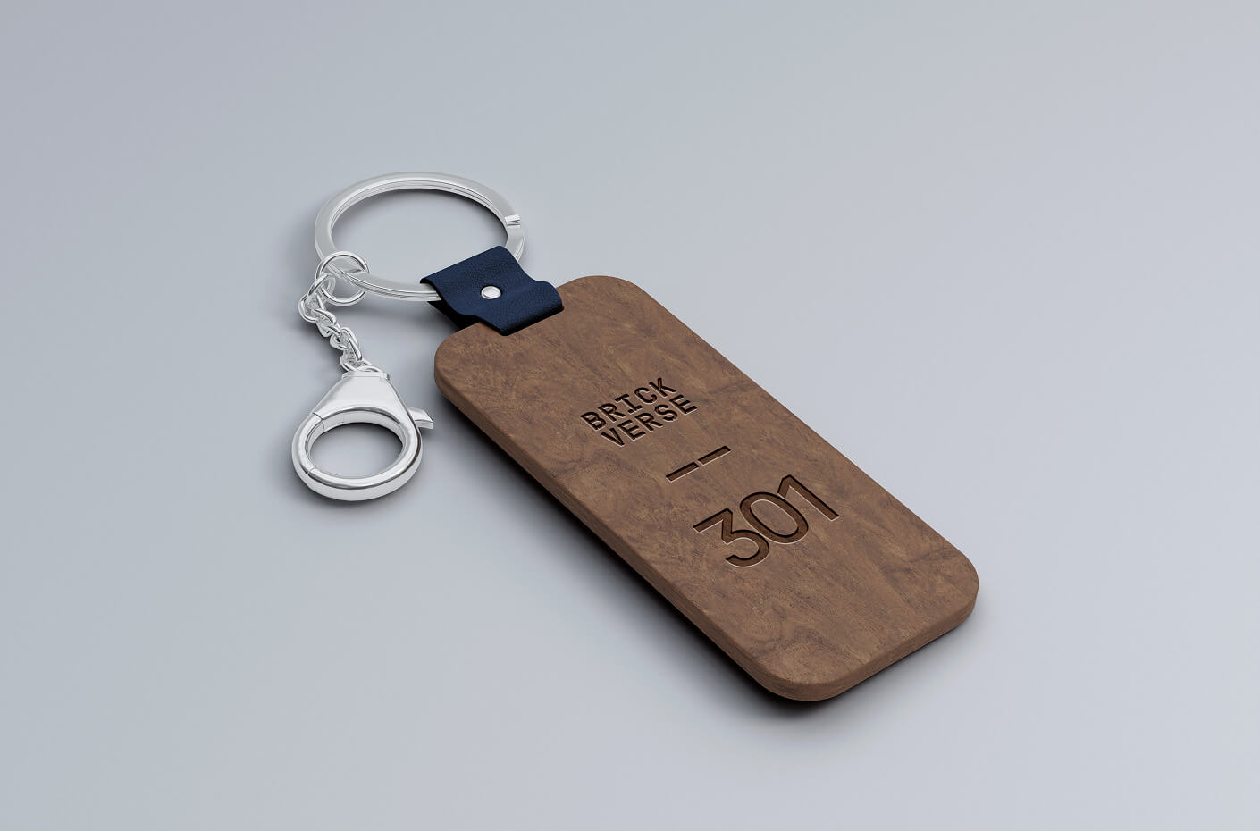
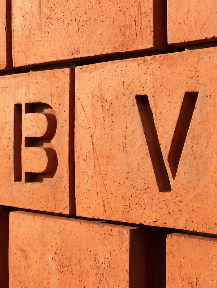
The logo gives it
structure.
The language gives
it warmth.
The publication gives it
a story.