Menu
Accelerating


Navy Blue Knight gives the identity its depth and institutional confidence, while Our Beige introduces warmth and a more human character. Together, they balance strength with approachability.
#001B4C
#003684
#D1B274
#DDDDDD
BW Gradual carries the identity across headlines and communication, echoing the geometric character of the mark while keeping the overall system contemporary and precise.
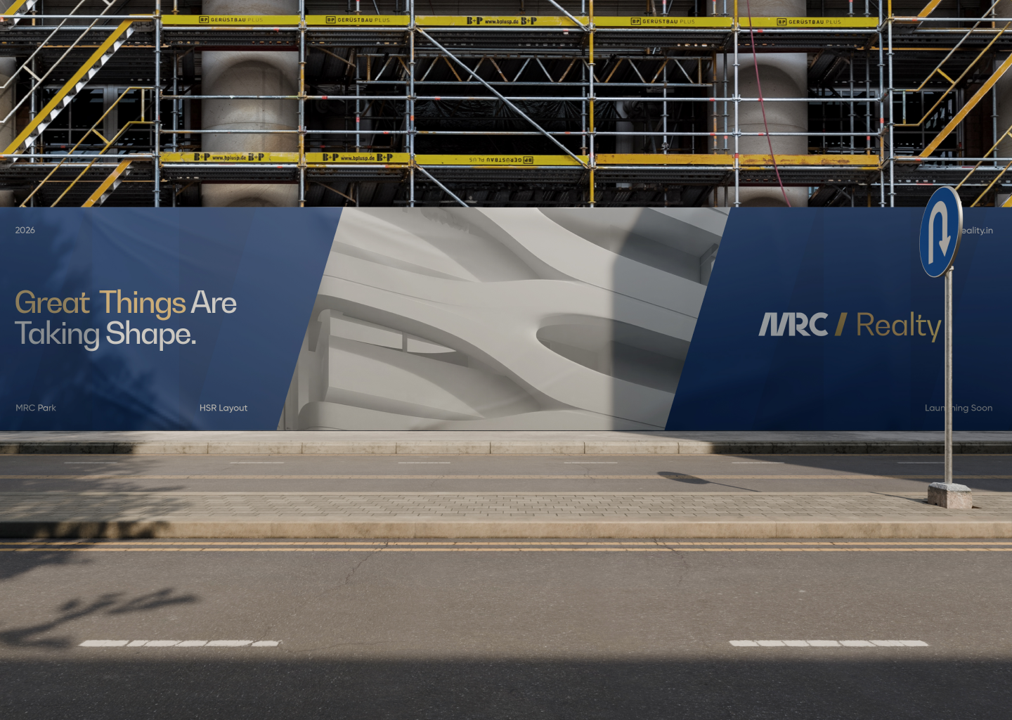
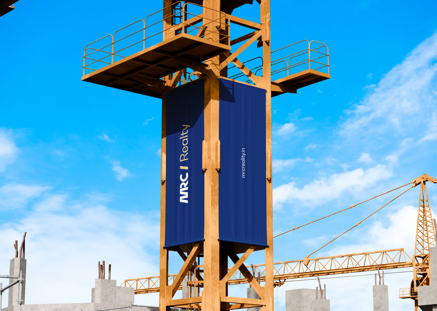
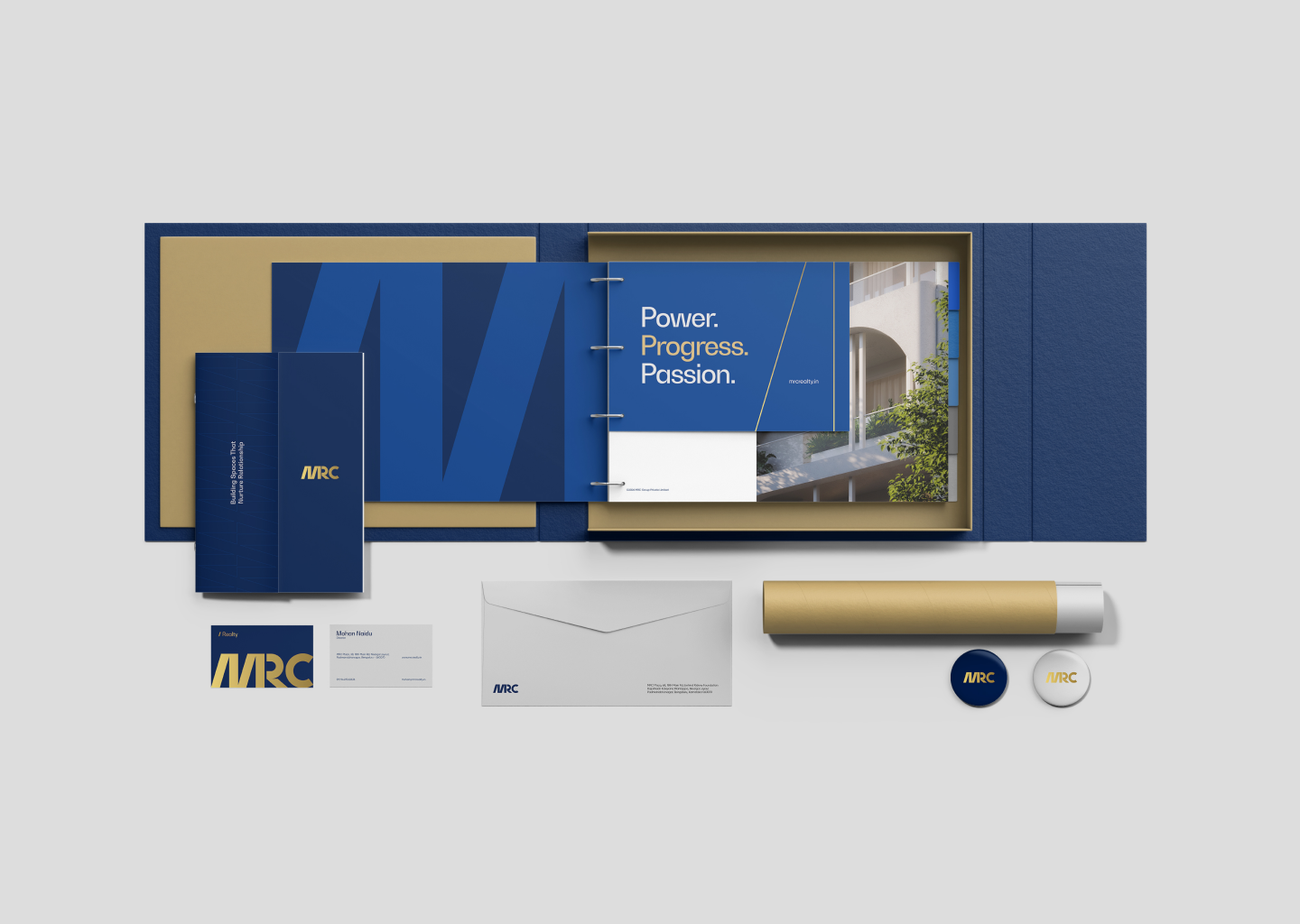
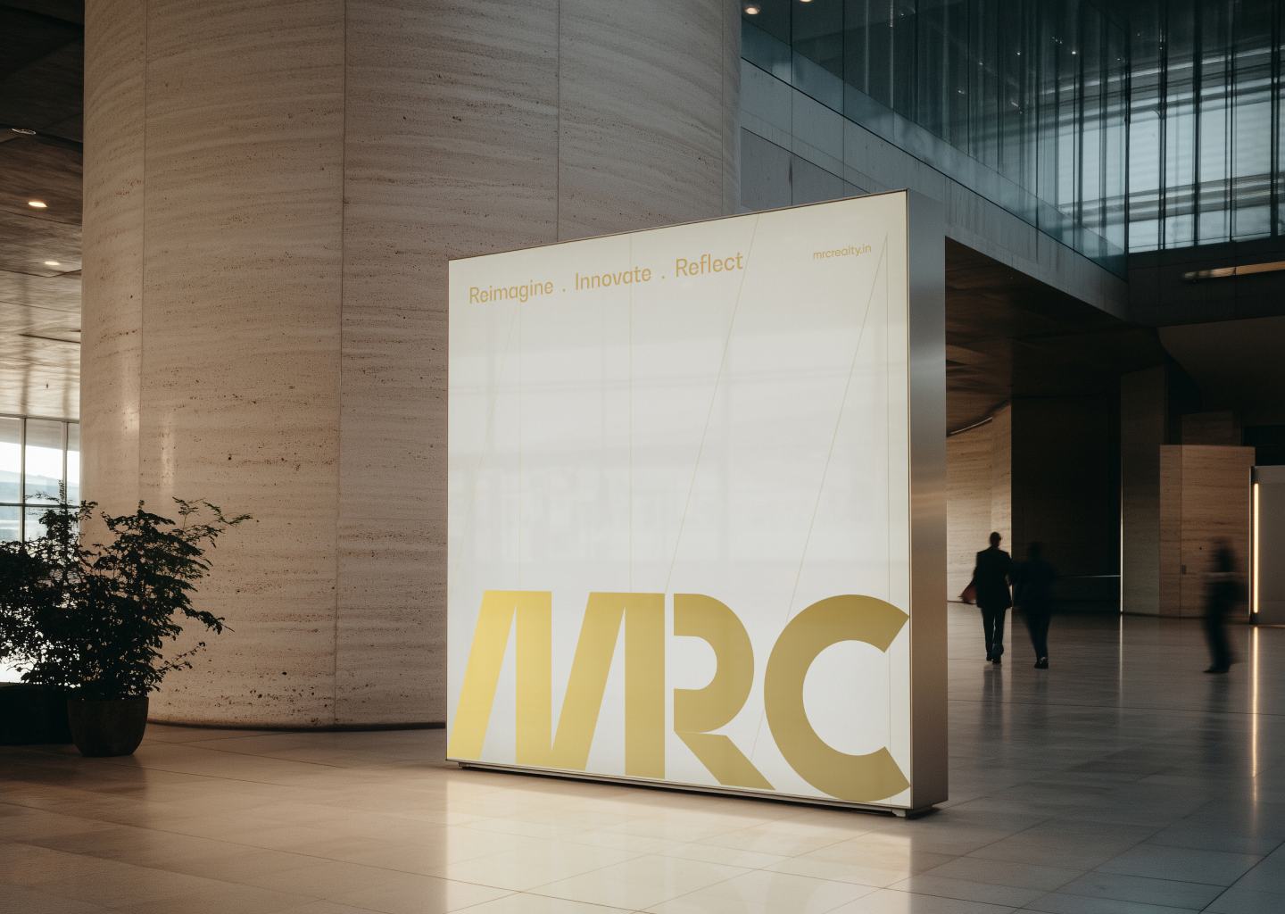
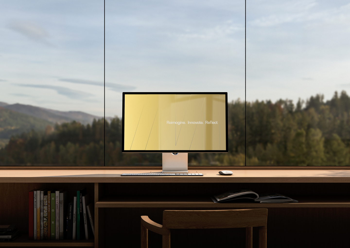
The verbal system translates Power and Progress into a consistent tone across the group. From Power. Progress. Passion. to Reimagine. Innovate. Reflect., the language speaks to a business defined by movement, ambition and possibility.

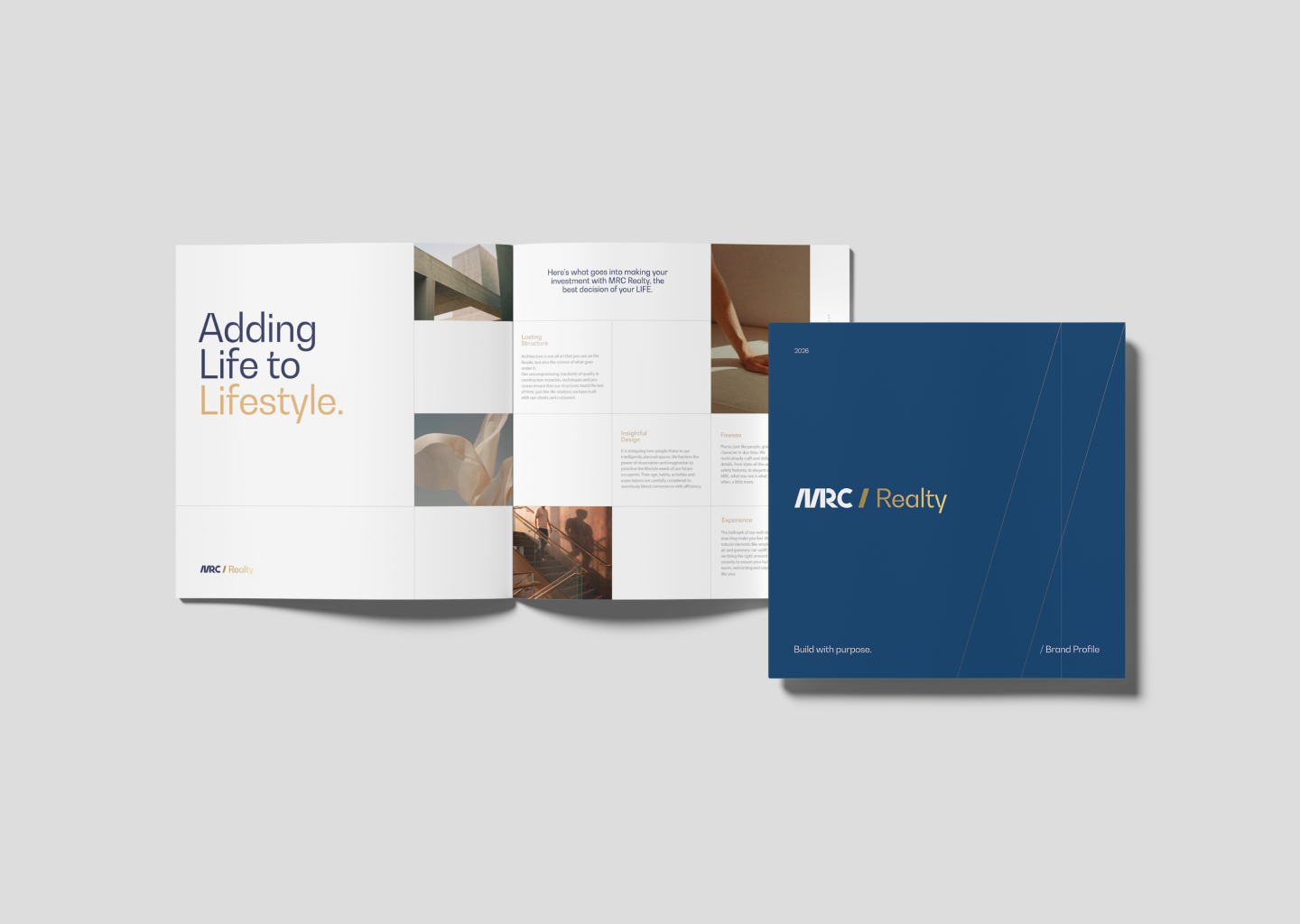
The publication system brings the new identity into a structured editorial format, using the same typography, colour and graphic language to make the group feel consistent across communication.
The website extends the rebrand into a clearer digital experience, carrying the same visual language across information, navigation and project communication.
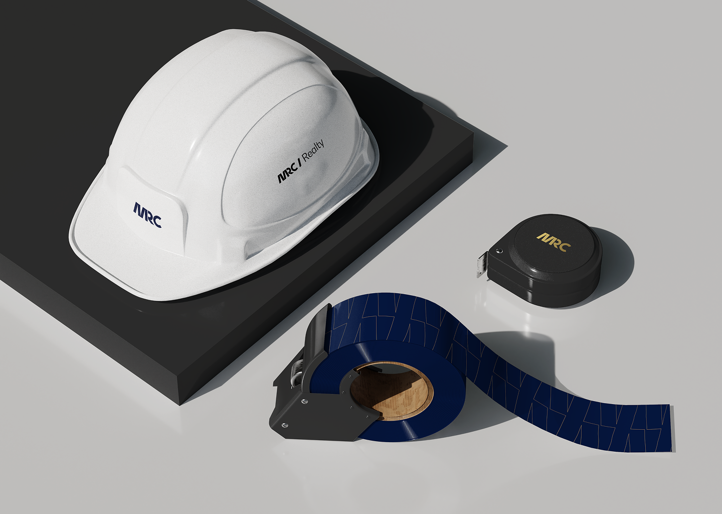
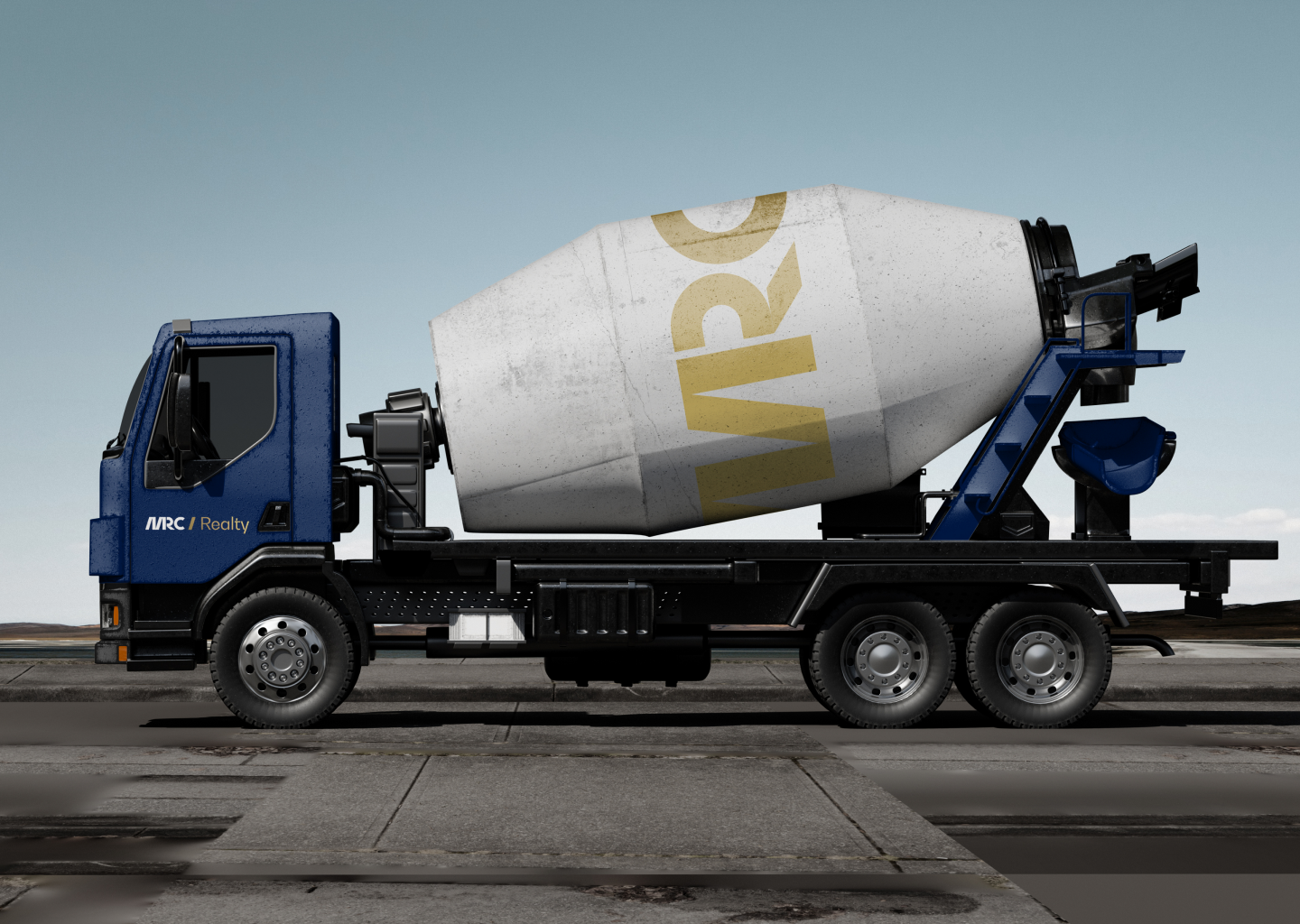
The identity extends beyond print and screen into office elevation, facade and signage. The same geometry and visual language turn physical touchpoints into recognisable expressions of the MRC brand.
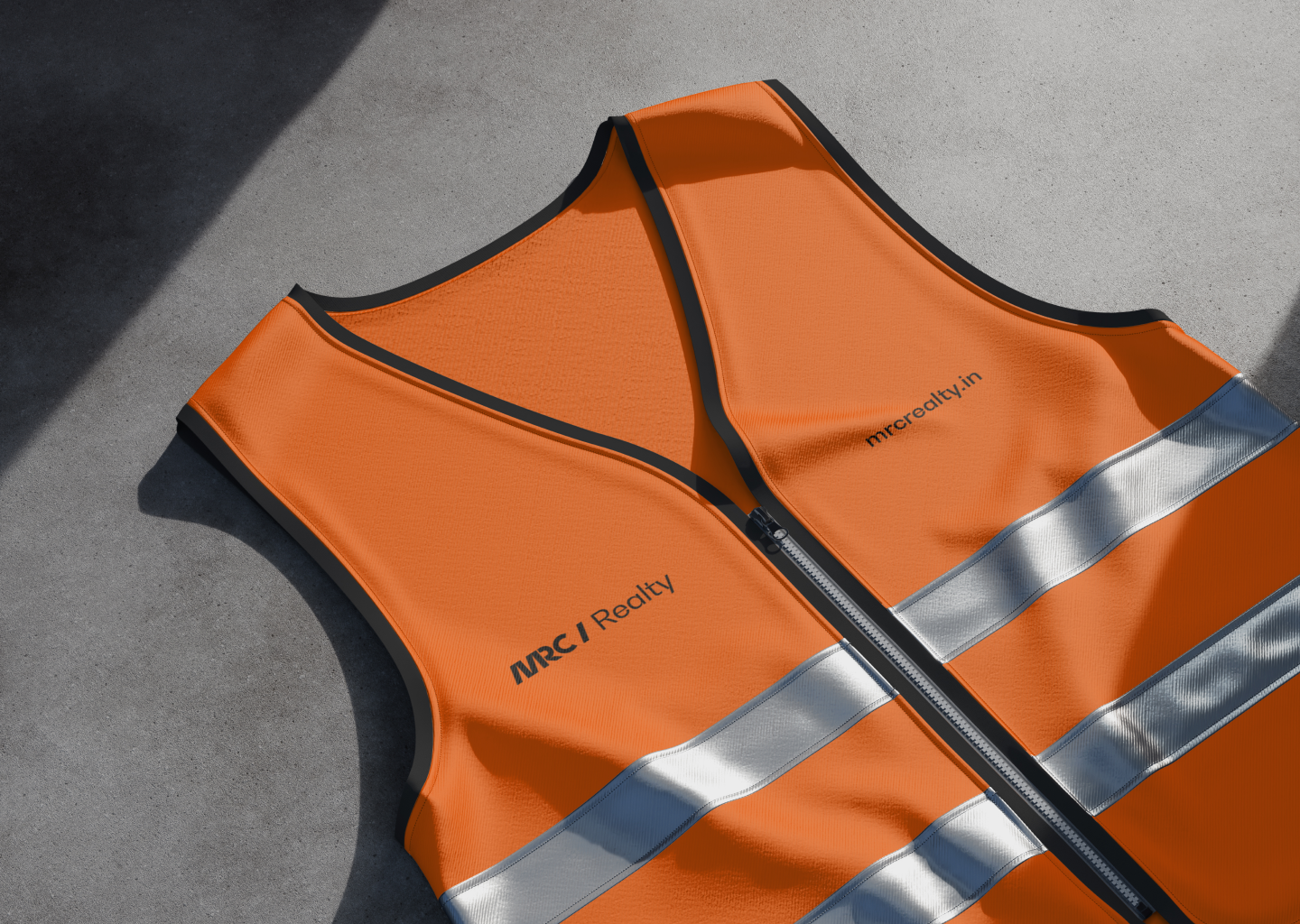
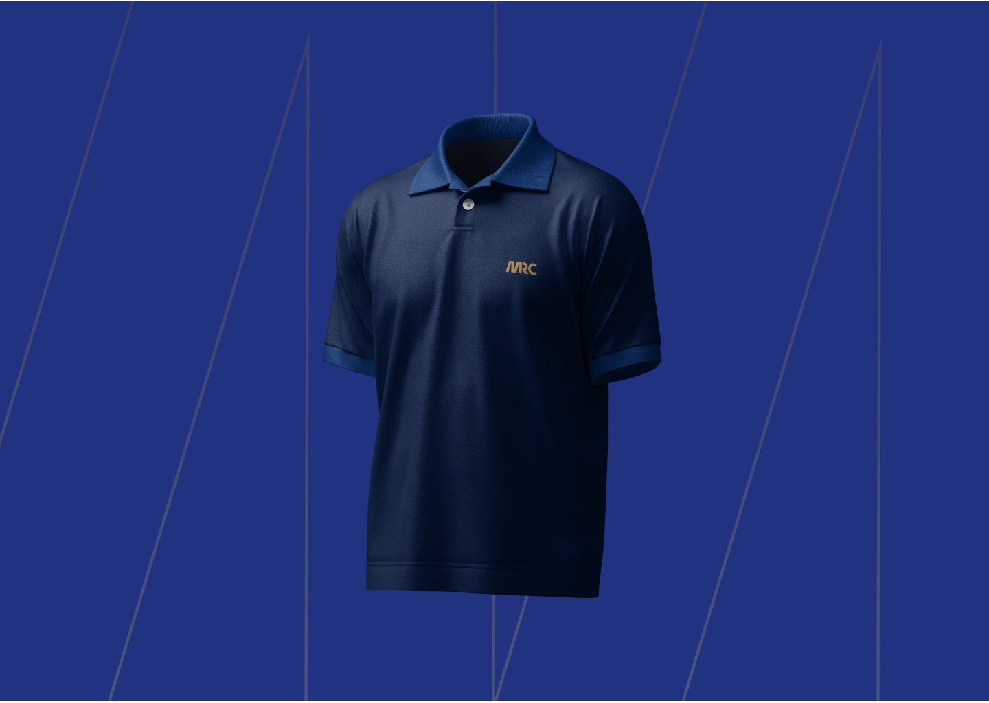
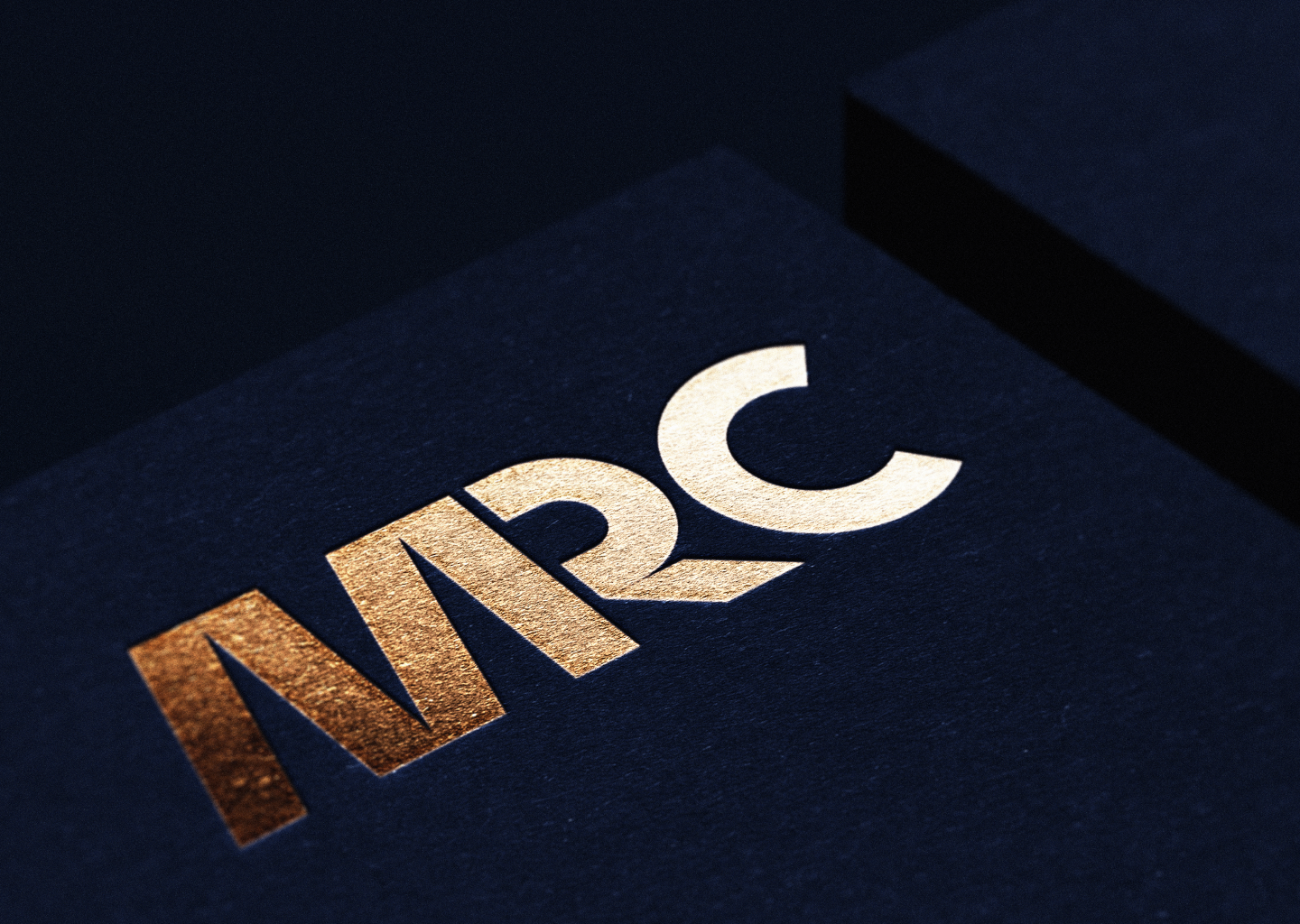
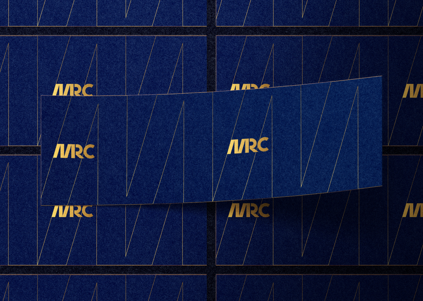
From the monogram to the pattern, language and physical applications, every element works from the same idea of Power and Progress. A single system gives the group consistency while allowing each business to retain its own identity.


MRC already had the track record. The rebrand gave that track record a unified identity one built to represent where the group had been and where it was going.